Making complexity legible
A team assessment report that had to serve four audiences and two time points without losing clarity
💬 Some details in this case study have been adjusted or generalized for portfolio presentation. Core decisions and design rationale reflect the actual work.
Project
Team assessment report
Team
PM, People Analytics, Software Engineer
Scope
UX/UI Design
Timeline
2024

01_Context
Team wanted change. There just wasn't a shared idea of where to begin.
Background
To differentiate from individual coaching and address organizations' team-level needs, the company launched Team Coaching as a new program. The first step was the Team Compass, an assessment every team member completed, rating the team across 7 competencies. The results became a shared Team Report.
Goal
As the first activity in the coaching engagement, the report gave team leads, members, and coaches a shared read on where the team actually stood, and a starting point for what to work on next.
Team leads saw how their team actually viewed things, not just their own read
Team coaches used it to build a coaching plan grounded in real data
Members got visibility into the team's overall direction
02_Complexity
The complexity wasn't just in the data.
It was in what the program actually needed.
Too much to show at once
Distribution, team lead scores, competency-level indicators, open-ended answers. The report had more depth available than any single view could hold clearly.
Four different readers
Team leads, HR, coaches, and members needed the same report to show different amounts of that depth.
Two points in time
Baseline and Checkpoint data needed to sit side by side without doubling the noise.
A report that wasn't always finished
Results only appeared past a 4-response threshold, then kept updating live as more came in.
03_Craft Decision
Making it intuitive was the start.
Supporting how the program ran was the rest.
Clarity across audiences was the baseline. The bigger focus was supporting the coaching program's full cycle, since this report opened and closed it.
Comparing two points in time


Distribution, off by default
Distribution, off by defaultOnly average scores showed at first. Turning distribution on revealed individual responses, with a hover showing exactly how many people landed on each score.
Competency detail, one click away
Clicking a competency opened its definition and three indicator scores in a side panel, without expanding everything inline.
Role-based visibility
The report shipped in two versions, split by role, shaped by what the coaching program needed from each audience.
Full report
Lite Version

Audiance
Team Lead, Team Coach, HR Leader. This audience needed the full picture, not just to read it here, but to bring it into their own reporting.
Participation
Every member's response mattered, so this view gave leads and coaches visibility into who had participated, plus a way to encourage the few who hadn't.
Distribution
An average alone doesn't say much. This audience needed to see whether it hid a few outlying scores, and how a leader's own score compared with the team's.
Voice of the team
Surfaces the kind of context numbers can't, in the team's own words.
Comparing two points in time
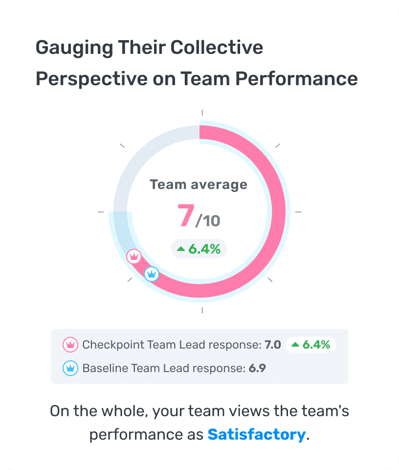


Color, not just position
Baseline and Checkpoint were color-coded, sky blue and pink, so the two data sets stayed distinct even when layered on the same scale.
Focus without losing the past
With both shown together, Baseline's opacity dropped to keep focus on Checkpoint, while still keeping the shift between them legible.
A precise read, not just an impression
A change indicator, like +2%, sat next to each score, so a shift read as precise information, not just a rough visual impression.
A report that wasn't always finished

Below the threshold
Fewer than 4 responses meant no results yet. A dedicated empty state explained why, tied to the confidentiality requirement, rather than showing a blank or broken-looking report.
Live, once unlocked
Past 4 responses, a "LIVE" badge sat in the participation section, borrowed from broadcast UI, signaling the report was still updating as more responses came in, not a fixed, final result.
04_How It Scaled
The report shipped first.
A system was built around it.
As Team Coaching matured, the report became the starting point for two things it fed into: an organization-wide view, and an AI-coach-driven next step.

Organization Snapshot
A heatmap rolling up Team Compass results across multiple teams, giving organization-level stakeholders a single view instead of opening each team's report individually.
Team Compass Debrief + North Star goal-setting
After the report, an AI coach walked the team lead through a debrief and helped them set a shared North Star focus for the team going forward. The North Star flow, spanning the start, reflection, option recommendations, and refinement, was something I led most of, working closely with a PM and engineer to shape it end to end.
05_Looking Back
A few years later, three things stand out.
The scope was tight and the tools were simpler back then. With more room and a lot more AI now, here's where I'd push further.
Behavioral focus, not just sequence
At the time, the report focused on clearly showing participation and results, in order. Today, I'd design toward more of an "aha" moment, the gap between how a leader sees the team and how the team sees itself, since this report was the very first step of coaching and needed to build motivation for what came next. Synthesizing that gap took more computation than a small team could build then; it's a much lighter lift with AI now.
Live should feel live
The "LIVE" badge communicated status, but an update landing didn't feel like an event, and a finished report didn't look meaningfully different from one still filling in. I'd design an actual interaction for both moments, something that responds when new data lands, and a clear, confident signal once the report was complete.
A preview of what's coming
Scope had to stay minimal at the time, so the empty state only explained why results weren't visible yet. I'd add a blurred or sneak-peek version of what the results would look like once unlocked, giving people a reason to check back rather than just an explanation for the wait.
06_Outcome
The report kept getting reused, long after it shipped.
This report was used regularly in the company's sales demos and marketing materials, and the Team Coaching program it supported launched with a number of enterprise clients.

Let's Connect.
Interested in product design,
behavior change, AI, and building systems that scale.
studiohaena3@gmail.com
linkedin.com/in/studiohaena
See more works
© 2026 Haena Lee